Happiness - A Data Viz Meta Analysis
Diving into different ways to visualize happiness data

Shri Khalpada
I recently came across a piece that examines the difference between "storytelling" and "exploration" in the context of data visualization. The piece, by Amanda Makulec, observes that the two serve fundamentally different goals, but are often conflated in the industry.
I wanted to explore (or I guess maybe tell a story about...) this distinction a bit more, as well as a few other factors that I think about when designing a visualization. My goal is to codify some of the broad decisions that go into designing a visualization, and to outline how those decisions can be translated into specific design choices.
The Approach
This was the broad question I wanted to dive into:
What specifically changes about a chart when it's designed to either tell a story or offer exploration?
As a believer in the power of example, I decided to use a single dataset and build a visualization whose goals could be tweaked in real-time by anybody as they were looking at it. The visualization, along with some notes explaining my design process, would change design depending on the goals.
It's worth noting that this isn't meant to be a guide on any specific tool or technology. I used Vue.js and p5.js to build what's on this page, but the goal is to focus on more universal design decisions and not the implementation details.
The Dataset
When I was thinking about what dataset to use, I wanted to find something that was interesting, had a lot of data, and was relatively accessible. I decided to use the World Happiness Report, which is a report published by the Sustainable Development Solutions Network. The report ranks countries by their happiness, breaking down happiness into a number of different factors. I augmented this data with simple regional data from The World Bank to make it easier to compare countries in the same region.
There are lots of ways to approach visualizing this dataset, depending on what you want to convey. I was most interested in seeing change over time for different countries, so a line chart seemed like a great choice.
Below is an initial visualization I made of the data, just to get a sense of what it generally looked like. Each line represents a country's happiness trajectory:
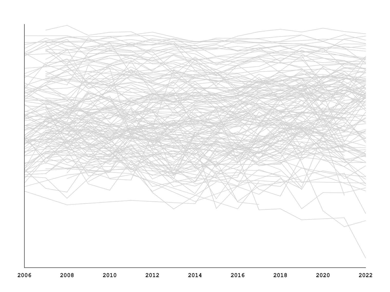
This is quite noisy and hard to get anything meaningful out of! The interesting thing, in my mind, was thinking about how to adapt this skeleton of a visualization across different use cases. Could the same simple and messy visualization be used as the foundation both storytelling and exploration?
Decision Points
I chose three main decision points to focus on:
- Interactivity: Is the visualization static or interactive? If it's interactive, what are the different ways that the audience can interact with the visualization?
- Primary Goal: What is the primary goal of the visualization? Is it to tell a story about a specific country? Is it to allow the audience to explore the data themselves?
- Communication: How precise is the visualization? Does it show exact numerical values? Does it show annotations? Does it show a legend?
Note that for the storytelling approach, I decided to specifically focus on the happiness trajectory of Venezuela, since there have been a lot of events, and subsequent swings in happiness, in the country over the last 16 years.
There are additional criteria to consider for a visualization, like the update cadence (is the visualization used for monitoring?), responsiveness (what types of devices will my audience use?), security (does the visualization show any sensitive data?) and more. The three we're focusing on gives us a good starting point.
The Visualization
Below is the final visualization and an interface to adjust features of the visualization.
We're just getting started.
Subscribe for more thoughtful, data-driven explorations.